#Hforhelium
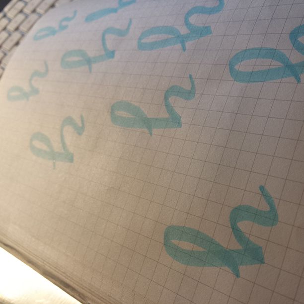
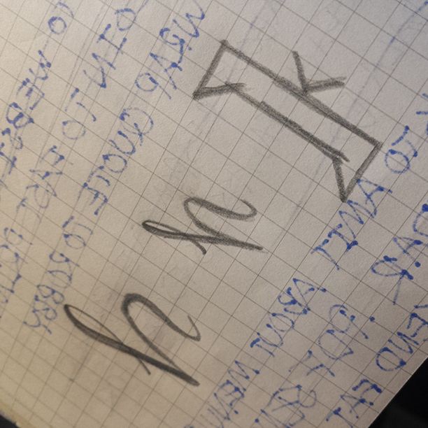
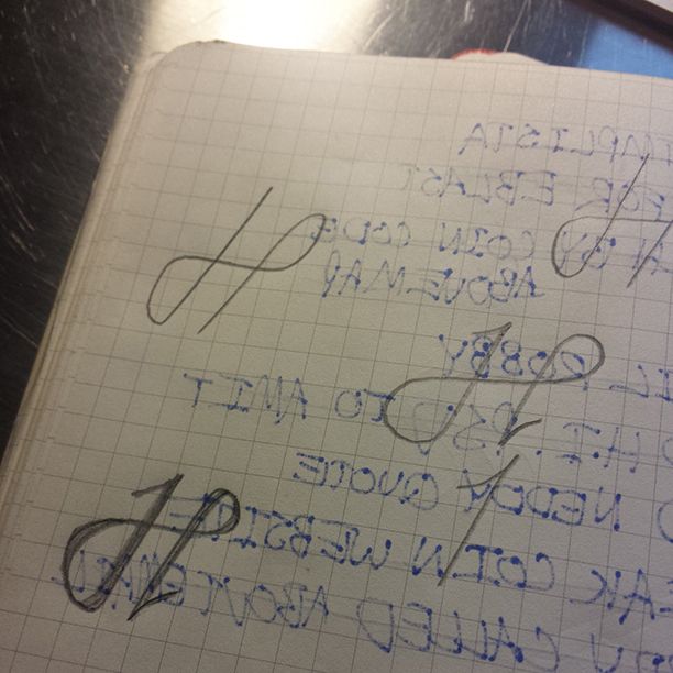
What started as one nifty little custom typography piece to share on instagram has begun to take on a life of its own. I was doing research and preproduction for a client project last week and stumbled across this beautiful mark + business card for Mamzelle & Co. in Montreal. I fell in love. The ornate M, elegantly placed on such a clean card, the color, all of it. Everything was perfectly executed in my eyes but I was particularly fond of what was done with the M mark. Inspiration took hold and I clamored to make something similar.

![[the first installment of #Hforhelium]](http://www.heliumcreative.com/wp-content/uploads/2014/03/H_typography_RGB-01.png)
-Casey


